
Michele Bullock, RBA Assistant Governor, Financial System
Speech at Ai Group lunch in Albury (10 September 2018): The Evolution of Household Sector Risks
“Thank you for the invitation to speak at this Ai Group lunch. It is great to be back in regional Australia. I am responsible for the area of the Bank that focuses on financial stability. So my remarks today are going to cover one of the financial risks we have been focusing on over recent years – the high level of household debt in Australia. Household debt has been rising for a number of decades. How much of a concern is this? I am going to talk through the evolution of the current debt situation and how we see the current risks. Given that I am in Albury-Wodonga, I will finish with a few comments on housing markets and debt in regional Australia.
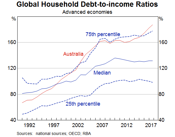
Household debt in Australia has been rising relative to income for the past 30 years (Graph 1). This graph shows the total household debt-to-income for Australia from the early 1990s until this year. Over that time it has risen from around 70 per cent to around 190 per cent. There are three distinct periods. The first, from the early 1990s until the mid-2000s, saw the debt-to-income ratio more than double to 160 per cent. Then there was a period from around 2007 to 2013 when the ratio remained fairly steady at 160 per cent. Finally, since 2013, the debt-to-income ratio has been rising again, reaching 190 per cent by 2018.
Australia has not been unique in seeing debt-to-income ratios rise. The median debt-to-income ratio for a range of developed economies has also risen over the past 30 years. But the Australian debt-to-income ratio has risen more sharply. In fact, Australia has moved from having a debt-to-income ratio lower than around two thirds of countries in the sample to being in a group of countries that have debt-to-income ratios in the top quarter of the sample. This suggests that there are both international and domestic factors at play when it comes to debt-to-income ratios.
There are two key international factors that have tended to increase the ability of households in developed countries, including Australia, to take on debt over the past few decades. The first is the structural decline in the level of nominal interest rates over this period, partly reflecting a decline in inflation but also a decline in bank interest rate margins as a result of financial innovation and competition. With lower interest payments, borrowers could service a larger loan. The second is deregulation of the financial sector. Through this period, the constraints on banks’ lending were eased significantly, allowing credit constrained customers to access finance and banks to expand their provision of credit.
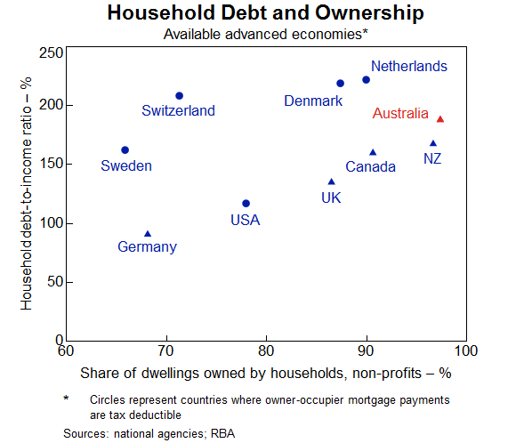
But as noted, in Australia the household debt-to-income ratio has increased more than for many other countries. The increase in household debt over the past few decades has been largely due to a rise in mortgage debt. And an important reason for the high level of mortgage debt in Australia is that the rental stock is mostly owned by households. Australians borrow not only to finance their own homes but also to invest in housing as an asset. This is different to many other countries where a significant proportion of the rental stock is owned by corporations or cooperatives (Graph 2). This graph shows for a number of countries the share of dwellings owned by households on the bottom axis and the average household debt-to-income ratio on the vertical axis. There is a clear tendency for countries where more of the housing stock is owned by households to have a higher household debt-to income-ratio.
Graph 2
Potential vulnerabilities
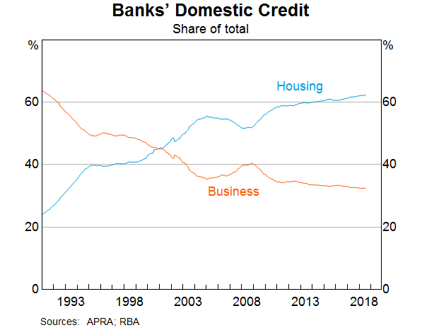
This high level of household debt relative to income raises two potential vulnerabilities. First, because mortgage lending is such an important part of bank balance sheets in Australia, any difficulties in the residential mortgage market could translate to credit quality issues for banks (Graph 3). And since all of the banks have very similar balance sheet structures, a problem for one is likely a problem for all. This graph shows the share of banks’ domestic credit as a share of total credit over the past couple of decades. Australian banks have substantially increased their exposure to housing over this period and housing credit now accounts for over 60 per cent of banks’ loans. So the Australian banking system is potentially very exposed to a decline in credit quality of outstanding mortgages.
Graph 3
The risk that difficulties in the residential real estate market translate into stability issues for the financial institutions, however, appears to be currently low. The Australian banks are well capitalised following a substantial strengthening of their capital positions over the past decade. While lending standards were not bad to begin with, they have nevertheless tightened over the past few years on two fronts. The Australian Prudential Regulation Authority (APRA) has pushed banks to more strictly apply their own lending standards. And APRA has also encouraged banks to limit higher risk lending. Lending at high loan-to-valuation ratios has declined as a share of total loans, providing protection against a decline in housing prices for both banks and households. And for loans that continue to be originated at high loan-to-valuation ratios, the use of lenders’ mortgage insurance protects financial institutions from the risk that borrowers are unable to repay their loans. Overall, arrears rates on housing loans remain very low.
But the second potential vulnerability – from high household indebtedness – is that if there were an adverse shock to the economy, households could find themselves struggling to meet the repayments on these high levels of debt. If they have little savings, they might need to reduce consumption in order to meet loan repayments or, more extreme, sell their houses or default on their loans. This could have adverse effects on the real economy – for example, in the form of lower economic growth, higher unemployment and falling house prices – which could, in turn, amplify the negative shock.
So what do the data tell us about the ability of households to service their debt? This graph shows the ratio of household mortgage debt to income (a subset of the previous graph on household total debt) on the left hand panel and various serviceability metrics on the right hand panel (Graph 4). The mortgage debt-to-income ratio shows the same pattern as total household debt-to-income – rising up until the mid-2000s then steadying for a few years before increasing again from around 2013. The dashed line represents the total mortgage debt less balances in ‘offset’ accounts. This shows that taking into account these ‘buffers’, the debt-to-income ratio has still risen, although not by as much. So households in aggregate have some ability to absorb some increase in required repayments.
Graph 4
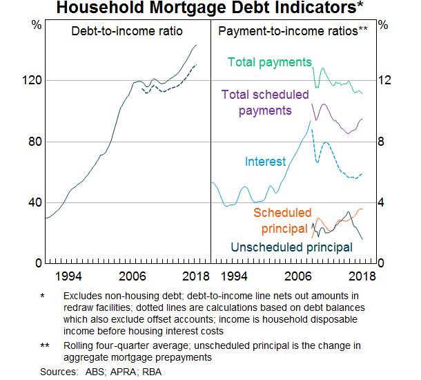
In terms of serviceability, interest payments as a share of income rose sharply from the late 1990s until the mid-2000s reflecting both the rise in debt outstanding as well as increases in interest rates. Interest payments as a share of disposable income doubled over this period. Since the mid-2000s, however, interest payments as a share of income have declined as the effect of declines in interest rates have more than offset the effect of higher levels of debt. Indeed even total scheduled payments, which includes principal repayments, are lower than they were in the mid-2000s, as the rise in scheduled principal as a result of larger loans was more than offset by the decline in interest payments.
The risks nevertheless remain high and it is possible that the aggregate picture is obscuring rising vulnerabilities for certain types of households. Interest payments have been rising as a share of income in recent months, reflecting increases in interest rates for some borrowers, particularly those with investor and interest-only loans. Scheduled principal repayments have also continued to rise with the shift towards principal-and-interest, rather than interest-only, loans. There are therefore no doubt some households that are feeling the pressure of high debt levels. But there are a number of reasons why the situation is not as severe as these numbers suggest.
First, the economy is growing above trend and unemployment is coming down. While incomes are still growing slowly, good employment prospects will continue to support households meeting their repayment obligations. Second, as noted earlier, households have taken the opportunity over the past decade to build prepayments in offset accounts and redraw facilities. In fact, despite the continuing rise in scheduled repayments, actual repayments relative to income have remained quite steady as the level of unscheduled repayments of principal has declined and offset the rise in scheduled repayments. Third, as noted earlier, lending standards have improved over the past few years, resulting in an improvement in the average quality of both banks’ and households’ balance sheets. Much slower growth in investor lending, and declining shares of interest-only and high-loan-to-valuation lending have also helped to reduce the riskiness of new lending. And at the insistence of the regulator, banks have been tightening their serviceability assessments. In addition, strong housing price growth in many regions over recent years will have lowered loan-to-valuation ratios for many borrowers. As noted earlier, arrears rates remain very low.
The discussion above has focussed on the average borrower but what about the marginal borrower? For example, will the tightening standards result in some households being constrained in the amount they can borrow with flow-on effects to the housing market and the economy? Our analysis suggests that while we should remain alert to this possibility, it seems unlikely to result in a widespread credit crunch. The main reason is that most households do not borrow the maximum amount anyway so will not be constrained by the tighter standards. While the changes to lending standards have tended to reduce maximum loan sizes, this has primarily affected the riskiest borrowers who seek to borrow very close to the maximum loan size and this is a very small group. Most borrowers will still be able to take out the same sized loan.
It has also been suggested that the expiry of interest-only loan terms will result in financial stress as households have to refinance into principal-and-interest loans that require higher repayments. Again, this is worth watching, but borrowers have been transitioning loans from interest-only to principal-and-interest for the past couple of years without signs of widespread stress. Our data suggest that most borrowers will either be able to meet these higher repayments, refinance their loans with a new lender, or extend their interest-only terms for long enough to enable to them to resolve their situation. There appears to be only a relatively small share of borrowers that are finding it hard to service a principal-and-interest loan, which is to be expected given that over recent years, serviceability assessments for these loans have been based on the borrower’s ability to make principal-and-interest repayments. So far, the evidence suggests that the transition of loans from interest-only to principal-and-interest repayments is not having a significant lasting effect on banks’ housing loan arrears rates.
The distribution of household debt
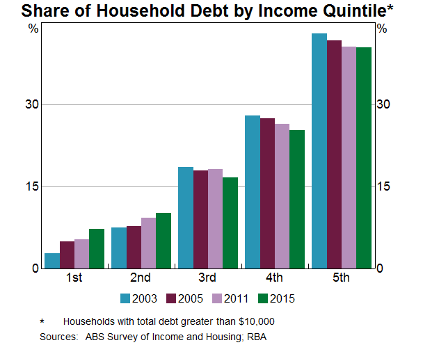
So far, I have focussed on data for the household sector as a whole. But an important aspect of considering the risks inherent in household debt is the distribution of that debt. If most of the debt is held by households with lower or less stable income for example, it will be more risky than if a substantial amount of the debt is held by households with higher or more stable income. In this respect, the data suggest that we can have some comfort. This graph shows the shares of household debt held by income quintiles – the bottom 20 per cent of incomes, the next 20 per cent and so on up to the top 20 per cent of incomes (Graph 5). And it shows how these shares have changed from the early 2000s until 2015, the latest period for which the data are available. Around 40 per cent of household debt is held by households that are in the top 20 per cent of the income distribution and this share has remained fairly steady for the past 20 years. Furthermore, households in the second highest quintile account for a further 25 per cent of the debt. So in total two-thirds of the debt is held by households in the top 40 per cent of the income distribution. Nevertheless, around 15 per cent of the debt is held by households in the lowest two income quintiles. Whether or not this presents risks is not clear. Retirees are typically captured in these lower income brackets and if this debt is connected with investment property from which they are earning income, it may not be particularly risky.
Graph 5
Another potential source of risk in the distribution of debt is the age of the head of the household. As noted, a regular, stable income is important for servicing debt so people in the middle stages of their careers typically have better capacity to take on and service debt. The next graph shows the shares of debt for various age groups for owner occupiers, and how they have moved over the past couple of decades (Graph 6).
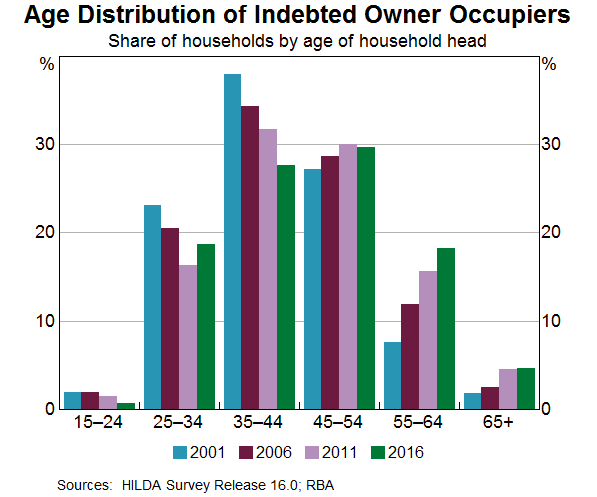
Households in which the head is between the ages of 35 and 54 account for around 60 per cent of the debt. But there does appear over time to be a tendency for a higher share of owner occupier debt to be held by older age groups. In part, the growing share reflects structural factors like lower interest rates. More importantly, it is not clear whether the higher share of debt increases the risk that these households will experience financial stress. On the one hand, it might indicate that in recent years, people have been unable to pay down their debt by the time they retire. If they continue to have large amounts of debt at the end of their working life, they might therefore be vulnerable. On the other hand, people are now remaining in the workforce for longer, possibly a response to better health and increasing life expectancies. They also hold more assets in superannuation and have more investment properties. This improves their ability to continue to service higher debt. And there is no particular indication that older people have higher debt-to-income or debt servicing ratios than younger workers.
So while the economy wide household debt-to-income ratio is high and rising, the distribution of that debt suggests that a large proportion of it is held by households that have the ability to service it. It nevertheless bears watching.
Regional dimensions
I thought I would finish off with some remarks about regional versus metropolitan differences. From a financial stability perspective, we are mainly focussed on the economy as a whole. But we still need to be alert to pockets of risk that have the potential to spill over more broadly. These risks may have important regional dimensions, particularly to the extent that individual regions have less diversified industrial structures and are thus more vulnerable to idiosyncratic shocks. One recent example has been the impact of the downturn in the mining sector on economic conditions in Western Australia, and the subsequent deterioration in the health of household balance sheets and banks’ asset quality. The potential for the drought in eastern Australia to result in household financial stress is another.
Data limitations make it difficult to drill down too far into particular regions. So I am going to focus here on a general distinction between metropolitan areas and the rest of Australia. As noted above, there tends to be a relationship between debt and housing prices. As housing prices rise, people need to borrow more to purchase a home and with more ability to borrow, people can bid up the prices of housing. So one place to look for a metro/regional distinction might be housing prices.
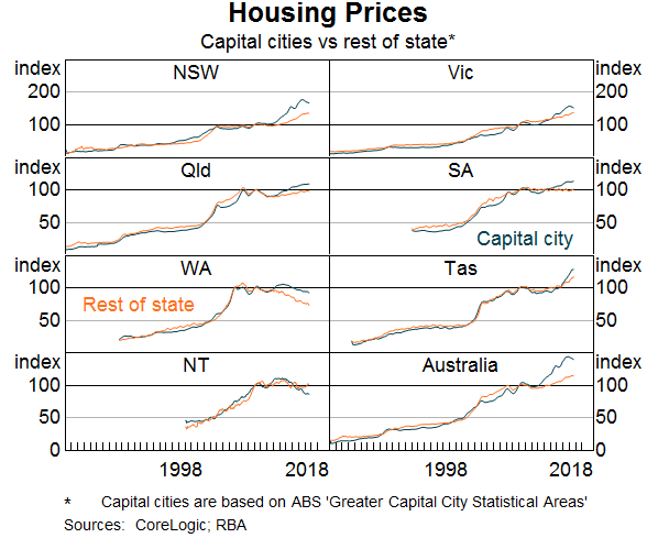
While there is clearly a difference in the absolute level of housing prices in cities and regional areas, over the long sweep, movements in housing prices in the regions have pretty much kept up with those in capital cities (Graph 7). This graph shows an index of housing prices for each of the states broken down into capital city and rest of the state. While there are periods where growth in housing prices diverge, most obviously in NSW and Victoria in recent years, they follow a very similar pattern. This partly reflects the fact that some cities that are close to the capitals tend to experience similar movements in house prices as the capitals.
Graph 7
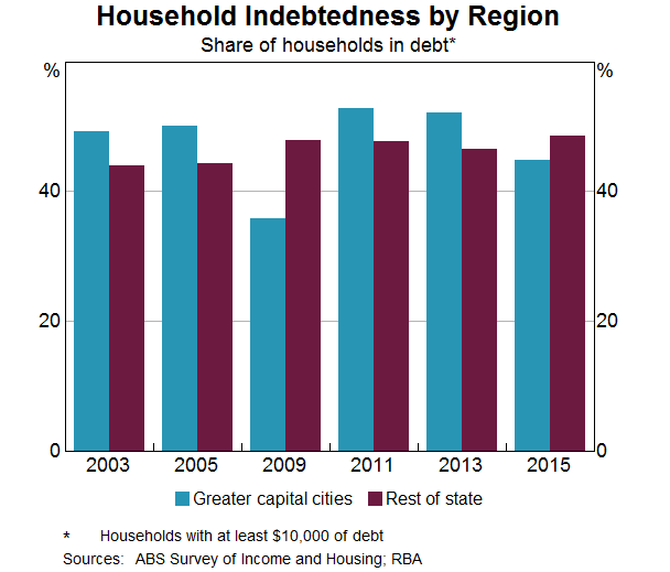
What about housing debt in regional areas? The data suggest that the incidence of household indebtedness is broadly similar in the capital cities and in the regions (Graph 8). In 2015, the latest year for which we have data, around 50 per cent of regional households were in debt compared with around 45 per cent of households in capital cities. But in previous years this was reversed. At a broad level, the proportion of households in debt seems fairly similar.
Graph 8
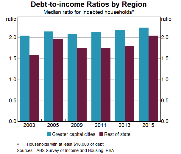
Incomes and housing prices tend to be lower on average in regional areas than cities so we might expect debt to also be lower. But how do debt-to-income ratios compare? This next graph shows debt-to-income ratios for cities and regional areas at various points over the past 15 years (Graph 9). In general, average debt-to-income ratios for indebted households in capital cities tend to be a bit higher than those for indebted households in regional Australia. But it is not a huge difference and it mostly reflects the fact that people with the highest incomes – and therefore, higher capacity to manage higher debt-to-income ratios – tend to be more concentrated in cities. In general, it seems that regional households’ appetite for debt is very similar to that of their city counterparts.
Conclusion
Household debt in Australia has risen substantially relative to income over the past few decades and is now at a high level relative to international peers. This raises potential vulnerabilities in both bank and household balance sheets. While the risks are high, there are a number of factors that suggest widespread financial stress among households is not imminent. It is nevertheless an area that we continue to monitor closely.
Thank you again for the opportunity to talk to you today. I look forward to your questions.”