
The importance of technical analysis in investing cannot be overstated; it is a cornerstone of stock research.

By recognizing patterns and signals through technical analysis, investors can better time their trades to capitalize on market movements.
QUICK SUMMARY
- Technical analysis is based on the idea that history repeats itself in the stock market
- Technical is used for identifying potential entry and exit points
- Understanding market sentiment
- Making informed short-term and long-term trading decisions
Technical Analysis: The Basics
Technical analysis is a method used by traders and investors to evaluate securites and forecast their future movements. It involves studying past market data, primarily price and volume data.
Unlike fundamental analysis, which looks at a company’s financial statements and market activities to estimate its value, technical analysis focuses on patterns and trends in the charts to help predict how stock prices may move.
Technical analysis is based on the idea that history tends to repeat itself in the stock market because it reflects the collective actions and psychology of market participants.
Chart Types and How to Read Them
Charts are a cornerstone of technical analysis, and there are 3 main types: Line Charts, Bar Charts, and Candlestick Charts.
- Line Charts
Line charts are one of the simplest and most widely used types of charts in technical analysis.
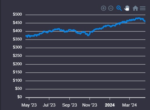
What is it: In the world of stocks, forex, or any financial market, a line chart is like your basic map. It plots the closing prices of a security (like a stock or currency pair) over a set period.
How it works: Line charts use closing prices for securities over time, although they can be adapted to use opening, high, or low prices. The result is a clear and straightforward representation of an asset’s price movement that can help investors and traders visualize trends and patterns quickly.
Good For: Line charts are important in technical analysis because they distill price information into an easily interpretable form, making them particularly useful for identifying overall trends and significant movements over longer periods.
Pros:
- Simplicity
- Effective for Time series data
- Comparison friendly
Cons:
- No information about the price range
- Over-simplification
- Not suitable for all data types
PRO TIP: While line charts are great for spotting general trends, they might not give you the full story. Serious traders often use them alongside more detailed charts like Candlestick or Barcharts, which provide insights into opening, high, low, and closing prices within the same timeframe.
- Bar Charts
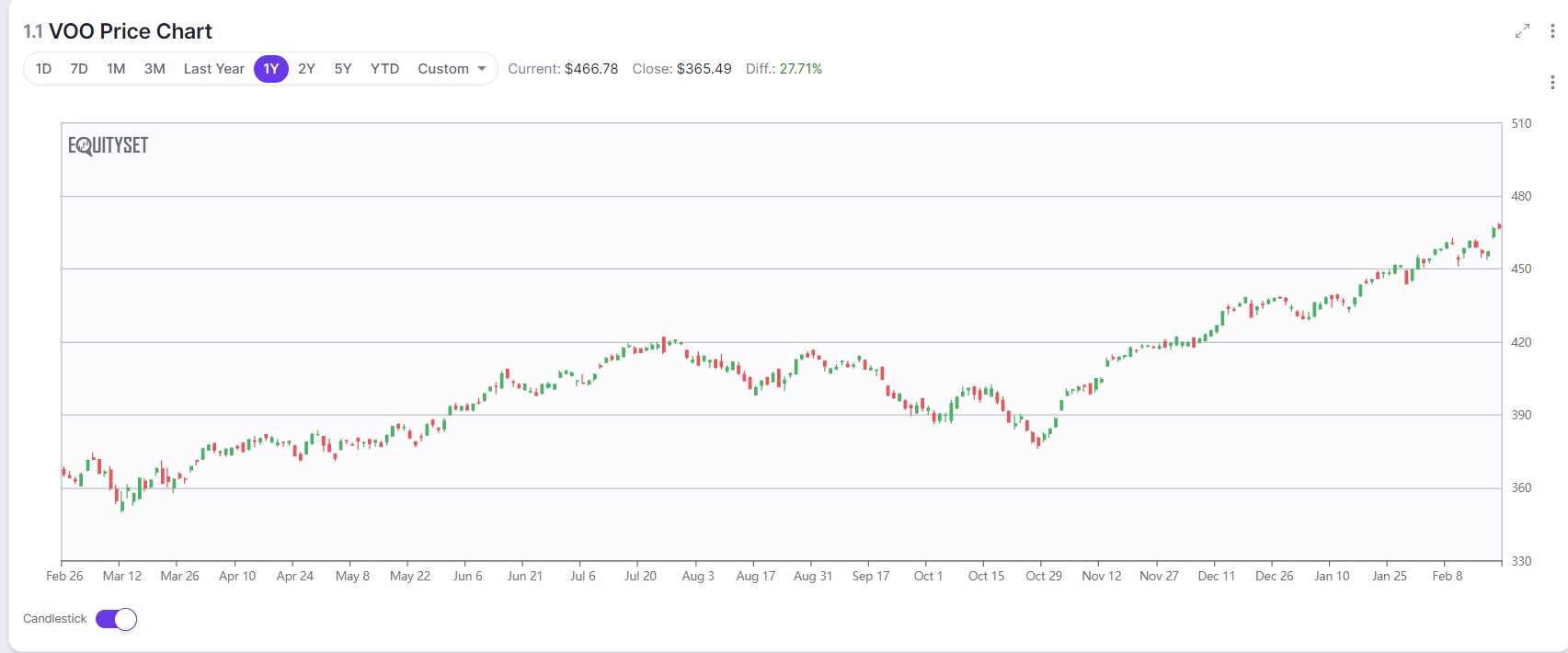
Bar charts are another technical analysis staple but offer a more detailed view of price action compared to line charts.
What is it: Each bar in a bar chart represents trading activity over a specific time period, which can range from minutes to weeks or even months. A single bar shows the opening price (usually marked by a horizontal line to the left of the vertical line), the closing price (indicated by a horizontal line to the right), and the high and low prices for the period (represented by the top and bottom of the vertical line, respectively).
How it works: The relevance of bar charts to technical analysis lies in their ability to provide a comprehensive snapshot of market sentiment within a given time frame. By analyzing the size and placement of the bars, traders can infer potential market directions and shifts in momentum. For example, a bar with a long tail (or shadow) at the bottom and a closing price near the top can indicate buying pressure, suggesting a bullish sentiment. Conversely, a bar with a long upper tail and a closing price near the bottom may signal selling pressure and bearish sentiment.
Good For: Identifying trends, reversals, and patterns such as channels, head and shoulders, or double tops and bottoms.
Pros:
- Intuitive comparisons
- Versatility in data presentation
- Clear display of negative values
Cons:
- Limited by space
- Not ideal for trend analysis
- can encourage misinterpretation
- Candlestick Charts
What is it: Candlestick charts offer a detailed view of price movements within specific time frames, ranging from minutes to years. These charts have gained widespread popularity among traders and investors for their ability to provide a comprehensive snapshot of market sentiment and potential price movements.
How it works: Each candlestick represents four key pieces of information: the opening price, the closing price, the highest price, and the lowest price during the period. The main body (or “real body”) of the candlestick shows the range between the opening and closing prices. A filled or colored body indicates that the closing price was lower than the opening price (bearish), while an empty or differently colored body signifies that the closing price was higher than the opening price (bullish).
Good For: Ability to highlight potential market reversals, continuations, and various patterns that are not as easily discerned on other chart types, like line or bar charts.
Pros:
- Detailed price information
- Visual Identification of Market Trends and Patterns
- Enhanced Analysis of Market Psychology
Cons:
- Complex for beginners
- Risk of overanalysis
- Not foolproof
Patterns formed by one or more candlesticks can indicate bullish or bearish sentiment and help traders make predictive analyses about future price movements. Examples of common candlestick patterns include the “Doji,” indicating indecision; “Hammer” and “Inverted Hammer,” suggesting reversal; and “Bullish Engulfing” and “Bearish Engulfing” patterns, signaling potential trend changes.
Technical Indicators
In technical analysis, primary technical indicators are tools used by traders and investors to forecast future price movements based on past market data.
These indicators can provide insights into market trends, momentum, volatility, and volume, helping to make more informed trading decisions. Here’s a casual rundown of some of the primary technical indicators:
- Moving Averages
Super popular for spotting trends. You’ve got the Simple Moving Average (SMA) and the Exponential Moving Average (EMA).
SMA gives you the average price over a specific period, smoothing out price data. EMA gives more weight to recent prices, reacting quicker to price changes.
- Relative Strength Index
This one’s all about momentum. It measures how fast prices are changing, telling you if a stock is overbought (might be too expensive) or oversold (might be a bargain).
If the RSI is above 70, it’s generally considered overbought. Below 30? Oversold.
- Moving Average Convergence Divergence (MACD)
Sounds complicated, but it’s just showing you the relationship between two moving averages of a price. MACD helps spot changes in momentum, direction, and strength of a trend.
When the MACD line crosses above the signal line, it could be a buy signal. Below? Maybe it’s time to sell.
Reading and Interpreting Charts
Understanding chart patterns and key levels can give traders a significant edge in predicting market movements.
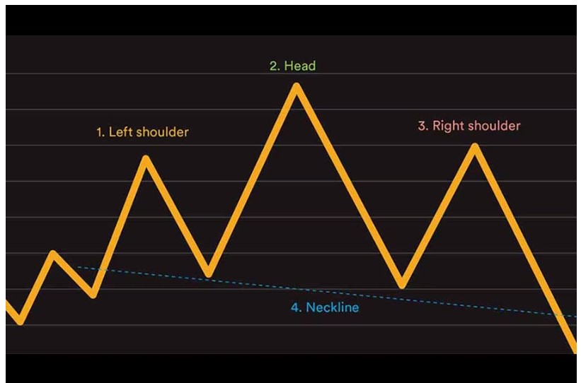
Head and Shoulders
What is it: A technical analysis pattern indicating potential trend reversals.
How it works: Comprises three peaks: a higher peak (head) between two lower ones (shoulders). Involves a neckline drawn by connecting the lowest points of the two troughs. A breakout occurs when the price crosses the neckline, confirming the trend reversal.
Good For: Predicting potential reversals in market trends. Traders looking to enter or exit positions based on forecasted market shifts.
Pros:
- Offers clear visual cues for identifying trend reversals
- Widely recognized and respected among traders, enhancing its reliability
- Can be applied across various time frames and market conditions
Cons:
- False signals can occur, leading to potential misinterpretation
- Requires confirmation through other indicators (like volume) for higher accuracy
- May not be as effective in highly volatile markets where patterns can be disrupted
Double Tops and Bottoms
What is it: A chart pattern used in technical analysis to signal a potential change in market direction, characterized by two consecutive peaks (double tops) or troughs (double bottoms).
How it works: Double tops occur after an uptrend and signal a potential reversal to a downtrend when the price fails to break through a resistance level twice. Conversely, double bottoms appear after a downtrend, indicating a possible shift to an uptrend when the price cannot breach a support level twice. The pattern is confirmed when the price breaks through the neckline (the level between the two tops or bottoms).
Good For: Identifying opportunities to buy or sell based on anticipated reversals in the market trend. It’s particularly useful for traders looking to capitalize on early signs of market shifts.
Pros: It provides a clear and straightforward indication of market sentiment shifting. When correctly identified, it has a high success rate, offering traders valuable entry or exit points. The pattern is easy to recognize and can be found across different time frames and markets.
Cons: Risk of false signals, where the pattern appears but does not lead to a significant trend reversal. Requires confirmation from additional indicators or volume analysis to increase reliability. The effectiveness can vary depending on market conditions and the presence of other confirming signals.
Triangles
What is it: Triangles are chart patterns used in technical analysis, representing a pause in the trend during which the price moves within a narrowing range. They are categorized into symmetrical, ascending, and descending triangles, each indicating the consolidation of a trend and hinting at the direction of the next breakout.
How it works:
- Symmetrical triangles form when the price converges so that the slope of the highs and the slope of the lows converge towards a point. This indicates uncertainty and typically resolves in the direction of the previous trend.
- Ascending triangles are characterized by a flat upper trend line and an ascending lower trend line, suggesting bullish sentiment and a potential breakout upwards.
- Descending triangles feature a flat lower trend line and a descending upper trend line, indicating a bearish sentiment and a likely downward breakout.
Good For: Identifying potential continuation of a trend after a period of consolidation. These patterns help traders anticipate the breakout direction, providing opportunities for entry or exit before the price movement becomes more pronounced.
Pros:
- Offer clear visual signals for potential breakouts, making them useful for planning trades
- Can be applied in both bullish and bearish markets, providing versatility
- Triangles often come with measurable targets, improving risk management
Cons:
- The direction of the breakout can sometimes be unpredictable, especially with symmetrical triangles, requiring careful monitoring and confirmation. False breakouts are common, necessitating the use of other indicators for verification
- Timing the breakout can be challenging, as triangles may form over varying periods. Therefore, patience and timing are crucial for success.
Flags
What is it: Flags are short-term continuation patterns seen in technical analysis that signal a consolidation phase followed by a breakout in the direction of the prevailing trend.
How it works: Flags form after a steep price movement, followed by a rectangular consolidation that slopes against the trend direction, resembling a flag on a pole. The breakout typically resumes in the direction of the initial trend.
Good For: Identifying potential continuation of a strong trend after a brief consolidation, offering traders opportunities to join the trend with a relatively low risk. These patterns are particularly useful for capturing quick moves in the market following a period of pause.
Pros:
- Provide clear entry and exit points, with the consolidation offering a tighter range for setting stop losses
- High probability of continuation in the direction of the trend before the pattern formed
- They are quick to form and easy to spot, making them ideal for short-term traders looking for momentum plays
Cons:
- Risk of false breakouts, where the price action moves out of the consolidation pattern but quickly reverses, requiring additional confirmation.
- Limited time frame, as these patterns are typically short-term, demanding timely execution and close monitoring of trades
- May be less reliable in less volatile markets, where the momentum necessary for a strong breakout is lacking
The Bottom Line
Technical analysis is just one of many ways to research stocks, but it is a great place to get started. Using some of the techniques listed above, you’ll be on your way to becoming a stock analysis pro in no time.